
Website Design Namibia
Minimalist vs Detailed Web Design – Pros & Cons
This guide explains the difference between minimalist, detailed and hybrid web design styles, with practical examples for businesses in Namibia and South Africa.
Your website is often the first place people meet your business – long before they phone, email or visit. The style of your website design plays a big role in whether they trust you, understand you and feel ready to take the next step.
Many small businesses ask for a “clean, modern website” – which usually means minimalist design. At the same time, their industry requires clear explanations, service breakdowns and proof of experience. That pulls the design in the opposite direction: more detail.
As a website designer in Namibia, Vivid Vista Creations often sits in the middle of this conversation. The goal is to balance a modern, uncluttered layout with enough information to build trust. This article will help you understand which design style fits your business, before you request a quote through the Website Project Planner or contact page.
1. What Do We Mean by “Website Design Style”?
When we talk about “design style”, we are not only talking about colours and fonts. Style is about how information is presented and how your website guides visitors from “just looking” to “ready to contact you”.
In this article we focus on three broad styles:
- Minimalist design – lots of white space, very few elements, simple typography, a small amount of text. Every section is extremely clean and stripped back.
- Detailed or content-rich design – more sections, supporting text, icons, diagrams, explanations, case studies and FAQs. Still modern, but information-led.
- Hybrid design – a balance between the two; clean layouts with clearly structured content so visitors never feel overwhelmed or lost.
The important point: none of these styles are “right” or “wrong” on their own. The question is: which one matches your business type, audience and goals?
2. Minimalist Web Design
Minimalist websites are popular because they look fresh and modern. When you search for “website design inspiration” you will see many examples: big headings, lots of empty space, one or two colours and small amounts of text.
What a minimalist website typically looks like
- Lots of white space with very few background images.
- Short, punchy headings and small blocks of text.
- It uses one main accent colour and one neutral colour.
- Very few icons or decorative elements.
- A clear, simple call-to-action such as “Book Now” or “Get in Touch”.
Advantages of minimalist design
- Fast loading – fewer images and scripts keep pages light, which helps both users and SEO.
- Mobile-friendly – simple layouts usually adapt well to phone screens.
- Modern look – many people associate minimalism with premium brands and tech startups.
- Easy to maintain – fewer blocks and components to update as your business changes.
- Helps focus – visitors are not distracted by too many elements on each page.
Disadvantages of minimalist design
- Can feel “empty” or unfinished if there is not enough information to support your offer.
- Limited space for explanation – not ideal for complex services or technical industries.
- Lower perceived credibility if visitors expect proof, examples or detailed processes.
- Fewer SEO signals – less text means fewer chances to target the keywords your clients search for.
Businesses that often suit minimalist websites
Minimalism can work very well when the “product” is visual or very simple to understand, for example:
- Photographers, designers and other visual creatives.
- Solo consultants or coaches with one clear service.
- Beauty brands or modern lifestyle products.
- App landing pages and small tech startups.
- Personal portfolios where the main goal is to show work, not explain processes.
If you run a small, visual brand and just need a simple online presence, a minimalist website from an affordable website designer in Namibia can be a great starting point.
3. Detailed or “Content-Rich” Web Design
Detailed websites are still modern and clean, but they give more space to information. They are designed for visitors who need to understand your services properly before they make contact.
What a detailed website typically looks like
- Several sections on the home page, each with a clear purpose.
- Service breakdowns showing how you work and what is included.
- Icons, diagrams or small graphics to support the text.
- Project examples, case studies or testimonials.
- Helpful resources such as FAQs, blog posts or downloads.
Advantages of detailed design
- Builds trust faster – visitors can see you understand your industry and have real experience.
- Better for research-heavy decisions – people can compare options and feel confident.
- Supports SEO – more structured content gives search engines more context about your services.
- Handles multiple services – ideal when you have several service lines or industries served.
- Pre-answers common questions – reducing the back-and-forth once someone contacts you.
Disadvantages of detailed design
- Requires more planning – you need to think through your content and structure properly.
- Can feel cluttered if done badly – too many elements without hierarchy can overwhelm visitors.
- Slightly heavier pages if a lot of images or diagrams are used without optimisation.
Businesses that often suit detailed websites
Detailed design is usually a better fit when you sell services that involve process, trust and comparisons, for example:
- Logistics and transport companies working across the SADC region.
- Construction, engineering and technical services.
- Accounting, legal and compliance-driven businesses.
- Marketing agencies and IT service providers.
- Tourism operators, lodges and travel services with multiple packages.
In these industries, visitors rarely make a decision purely on visuals – they need clear information. A content-rich layout often performs better than a very minimal one.
4. Why Minimalism Is Not Always the Best Choice
Minimalist design looks attractive on a design gallery, but not every business should choose it. In fact, for certain sectors a very bare layout can do more harm than good.
Some common problems we see when businesses choose minimalism just because it is trendy:
- Important detail goes missing. Visitors cannot see how you actually work or what you include in your services.
- The website feels thin. Potential clients might worry that your business is new, inexperienced or not fully established.
- Clients still need to email to ask basic questions. This slows down the sales process.
- SEO opportunities are lost. With so little text, Google has very little to work with when ranking your site.
For example, a logistics company in Namibia or South Africa usually needs to show routes, fleet types, industries served, documentation support and contact details for different regions. A single, almost-empty page with a large hero image and one paragraph is not enough to build trust at that level.
Minimalism works best for simple buying decisions. When a website needs to support high-trust, high-value or technical decisions, a more detailed layout is usually safer.
5. Why Detailed Design Can Outperform Minimalism
For many small and medium businesses in Namibia and South Africa, a detailed, well-structured website is not “too much” – it is exactly what their clients need to feel comfortable.
Detailed design often wins in these areas:
- Trust and credibility. When people see processes, certifications, project summaries and real photos, they feel safer choosing you.
- Conversion quality. Visitors who do contact you have already read the basics, so conversations move faster.
- SEO and discoverability. You can naturally include more phrases like “website design Namibia”, “small business website South Africa” or industry-specific terms.
- Long-term flexibility. It is easier to add new sections, services and case studies later.
The key is to keep the design organised. Detailed does not mean “busy” – it simply means that your content is given enough space to do its job.
6. The Hybrid Approach: Clean but Informative
In practice, the best option for many businesses is a hybrid design: a clean, minimal-feeling layout on the surface, with carefully structured content underneath.
A hybrid website typically:
- Uses modern, uncluttered sections and plenty of breathing space.
- Breaks information into short, focused blocks with clear headings.
- Combines icons and short paragraphs instead of large walls of text.
- Includes supporting pages (Services, Projects, FAQ, Blog) for visitors who want more detail.
- Guides visitors step by step towards a clear contact or quote action.
This is the approach Vivid Vista Creations usually recommends for small business websites in Namibia and South Africa: visually calm, but never so minimal that clients feel unsure about what you do.
7. How Your Design Style Affects SEO
Search engines do not care if your site is minimalist or detailed in terms of visuals – they care about content, structure and performance.
Design style influences SEO in a few indirect ways:
- Amount of text. Minimal pages often have very few words, which limits the phrases you can rank for. Detailed pages can naturally include terms like “web developer Namibia” or “affordable website design South Africa”.
- Headings and structure. Detailed or hybrid layouts typically use clear H2 and H3 headings, which help Google understand your topics.
- Internal links. More sections and pages create more opportunities to link to your services, portfolio and related articles.
- Performance. Any style can be slow if overloaded with heavy images. Clean development, optimisation and good hosting matter more than style.
At VVC, on-page SEO is built into every project: titles, headings, image alt text and internal links are aligned with how your clients search, whether you choose a simpler or more detailed layout.
8. Common Mistakes When Choosing a Design Style
Whether you want a very minimal website or a detailed one, there are a few traps that many businesses fall into:
- Copying competitors blindly. Just because another company uses a certain style does not mean it works well for their clients – or for yours.
- Choosing aesthetics over clarity. A beautiful layout that does not explain what you do will not bring more leads.
- Overloading pages with unstructured text. Detailed content still needs clear headings, spacing and hierarchy.
- Forgetting mobile visitors. A design that looks neat on desktop can feel cramped on a phone if not planned carefully.
- Not thinking about your client’s decision process. Some visitors decide quickly; others need step-by-step proof before they contact you.
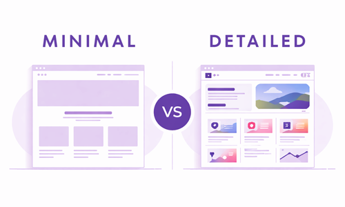
9. Quick Visual Comparison: Minimal vs Detailed
Here is a simple text-based comparison to help clarify the differences:
Minimalist Web Design
- Very clean and simple
- Short content
- Few images or icons
- Strong focus on one action
- Great for visual or simple offers

Detailed Web Design
- Structured information sections
- More text and explanations
- Icons, diagrams and examples
- Multiple ways to learn about you
- Great for complex or high-trust services
You can also think of it this way:
- Choose a more minimalist feel if your services are simple to grasp and your brand is strongly visual.
- Choose a more detailed layout if your services involve process, compliance, technical work or large projects.
- Choose a hybrid approach if you want a calm, modern look but still need enough content for SEO and client confidence.
10. Namibia and South Africa: Local Expectations Matter
In practice, local expectations also influence what works. Many clients in Namibia and South Africa still prefer to see enough information on a website before they phone or email.
Some patterns we see in this region:
- Logistics, construction, engineering and professional services usually benefit from detailed or hybrid layouts that explain capabilities clearly.
- Tourism businesses need rich visuals and structured information about accommodation, activities and rates.
- Freelancers, creative studios and small boutiques can successfully use more minimal, brand-led designs – as long as contact options are clear.
The right decision is not based only on global design trends, but on the real expectations of your local audience.
11. What Vivid Vista Creations Recommends
Vivid Vista Creations designs and develops modern, responsive websites for businesses in Namibia and South Africa. In most cases, the recommended approach is:
- Clean structure first – clear headings, simple navigation and logical flow.
- Enough detail to build trust – service breakdowns, FAQs and examples where needed.
- Avoiding unnecessary clutter – no noisy animations or confusing layouts.
- Mobile-first design – layouts are planned for phones from the start.
- On-page SEO basics done properly – titles, headings and internal links aligned with how people search.
You can see how this balance looks in practice by visiting the VVC website portfolio, where each project is designed around the specific needs of that business, not just a trend.
12. How to Choose Your Website Style with VVC
The easiest way to decide between a more minimalist, detailed or hybrid layout is to start with your business goals and content, not with a visual trend.
Vivid Vista Creations uses a simple Website Project Planner that asks about your services, ideal clients, locations, and what you want the website to help you achieve. Based on that, VVC can suggest a structure and design style that fits – whether you need a small business website in Namibia, a more advanced site, or a redesign of your existing presence.
Use the Website Project Planner
If you prefer a short message instead, you can also reach out via the contact page with a brief description of your business and what you have in mind.
13. Related Reading: Website Costs and Planning
If you are still in the early stages of planning your website, it may also help to understand typical web design budgets and what affects the price. VVC has a separate guide that explains this in plain language:
Together, these articles will give you a clearer picture of both the look and budget for your next website project.